Postcards about Friendship

April 29th, 2007

Via Pippoburro:

You are invited to take part of mail art project “FRIENDSHIP”, that will capture universal meanings of friendship through artistic images.

Size: Send postcards only in any medium that deals with any technique. (No Return * No Fee * No Jury * All entries must be sent by “snail mail”.)

Info: sidtome via yahoo.com.br

Online documentation to participants at http://www.friendshipmailart.blogspot.com

Deadline to be received: September 30, 2007

US postage for a postcard to Brazil is 75¢.

Please include name, surname, country, address, e-mail address & web site.

Address
Sidney Tome & Beatriz Tome
R. Pedro de Godoi, 269 – Gardenia 123
São Paulo – Brasil – 03138-01

Bursts of creativity on Sunday

April 23rd, 2007

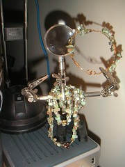
Green shell necklace & bracelet

Originally uploaded by Elaine with Grey Cats.

Christine mentioned she needed some green and purple earrings to go with some of her outfits recently. When i passed a rack of beads at the craft store, i had an excuse to browse. Note that i’ve made a bracelet and necklace but not quite the earrings.

The bracelet is a little large and a less graceful that ideal — i rushed it. But i can’t manage leaving projects dangling around these days.

I also shot a handful of frames from Roll2007.06, lingering in my camera from our trip to Florida in late February. A flock of Cedar Waxwings was feeding on the eucalyptus blossoms yesterday afternoon, and they’re back this morning. I think i can smell the honeyed scent of nectar this morning — surely that’s a jasmine somewhere and not the eucalyptus. Yet watching the birds feed on the pompom blossoms, it seems they should have a wonderful scent.

Another opportunity for writers, this in the SF Bay Area

April 15th, 2007

At Foothill, where I have been taking geography courses the past three quarters, there is a summer writers conference. I’ve been thinking more about writing lately, but i think this summer will be occupied with plenty of digital-creativity events. I imagine i will not need another event, and don’t think i can pull my (digital) scribbles together before then. The conference looks like it would be wonderfully welcoming though, so i’ve put a reminder in my calendar to check next year.

The Beat Museum and the 2007 Poetry contest

April 14th, 2007

Write? Formal or fast fiction, experimental or experienced, poems no longer than three double spaced ages long are welcome to the contest. There is a $5 for one/$10 for three reading fee; since visiting the Beat Museum, i feel supporting their efforts, which include taking the story of the Beats to schools and colleges, is well worth it.

See the Contest Rules for more details. The January and February winners are posted.

Still in progress

April 4th, 2007

Still in progress

Originally uploaded by Elaine with Grey Cats.

This is as much would fit on the scanner, perhaps the center. What i like about it so far is scraping off the red to reveal the textured surface below. (See here for the white & black layer.) I also like the almost opalescent effect of the green through the red.

Christine likes the red very much, which reminds me too much of ground beef. Her reaction triggers an almost perverse sense of challenge: can one paint expressionistically of intense emotion and use blues and greens?

The red: naphthol light red with a bit of q. magenta and some carbon black, mixed both with matte and gel medium

Color Notes

April 1st, 2007

Medium Hansa Yellow is the color of field daffodils, two bundles for $2.50 at the grocery.

Last night i used the fan brush, some soft gel, and the liquid hansa yellow and a touch of quid. red to paint a sheet of water color paper. I don’t know why i am so fond of yellow as a background, because i don’t think it is a good background, technically.

However, i’m preparing myself to ruin the lovely field of daffodil yellow (the streaks of quid. red from the base giving a subtle “up” and “down”-ness, a warmer weight at the base) with some blue. I ought to make the paint opaque, but still find myself enamored with the floating color in the clear gels.

We’ll see what happens.

Experiments in acrylics

March 23rd, 2007

070322b-Paint.jpeg

Originally uploaded by Elaine with Grey Cats.

This is an experiment with textures and techniques. I’ve made much use of Golden’s tar gel mixed with clear gel medium and the Golden liquid acrylics. It’s also my first use of a pearlescent liquid, adding that optical effet to the high gloss of the tar gel and the clear gel medium.

The surface is 9″x12″ paper, lightly gessoed. I sprayed the surface with water and used a fan brush with the liquids. The staining from that process is wonderful and delicate, but i wanted to play more. A small sea sponge, a palette knife, and my fingers were the main tools in applying, removing and reapplying the paint.

Carrot Pulp Paper

February 28th, 2007

I bought a juicer recently. At the time the refurbished Waring JEX328 was at $25 from Amazon, and that seemed a perfect pricepoint for something i wasn’t sure i’d use. (And a great deal since we could use our “prime” free shipping. Right now, there’s an Amazon vendor selling at $48 and another at $100, not available for prime shipping.)

When i made the first juice batch, i was struck by how moldable and fine was the carrot pulp. Perfect for paper making. Last night i tasted the pulp. It tastes like cardboard. So i rolled some out and i’ve mixed a little salt in some other and molded a vessel (vase? bowl?). I popped the mini-sheets in the convection toaster oven and ran around 150° for ten minutes. They feel the consistency of damp cardboard, like is used for cereal boxes.

It seems worth digging out the old papermaking kit and giving it a go. That just makes small sheets; i may be interested in a 8.5 x 11 mold.

The amount of pulp created is significant, though, and could create a *ton* of paper. I’m attracted to the thought of disposable carrot pulp bowls and plates: carrot machie, if you will.

Skimming resources, it’s clear that there are plenty of additives to make things “better” but i think i’ll start with just the pulp and see what happens. I initially thought that i’d want to add sizing (a starch, white glue, or gelatin — not rosin-alum because that degrades into the “acid” that makes papers age) to reduce ink bleed. But it seems like it might be better to add a surface treatment after making the paper: painting with a gelatin or white glue or starch mix, or using the calligraphy rosin.

It seems more likely that i’d need to treat the paper. After reading a great deal about boiling plant materials with ash (but never why), this resource explains that the soda or simple wood ash is to remove the lignin — another acid causing substance.
I thought it was to simply make pulping easier.

Reading notes follow.
Read the rest of this entry »
Roll2007 Film notes!

February 27th, 2007

On our recent trip i started my first rolls of 2007 (January wrapped up the last roll of 2006).

Roll2007.01 * Kodak 400 * 2007-02-24 * Landry’s in Tampa for Grandmámá’s 90th
Roll2007.02 * Kodak 400 * 2007-02-25 * Tarpon Springs and Manatees
Roll2007.03 * Kodak BW400CN * 2007-02-25 & 26 * Tarpon Springs & Honeymoon Island
Roll2007.04 * Kodak Select Royal Gold 200 * 2007-02-26 * Honeymoon Island
Roll2007.05 * Kodak 400 * 2007-02-26 * Honeymoon Island

[I think i shot some of Roll2007.06 on this trip, Kodak 400. Only development will tell -- 2007-05-14]
Read the rest of this entry »

Finishing Roll2006.12 … wait! Roll2006.12a

January 28th, 2007

The 15s and 4s shots were *much* better than the autoshot. I think i like the 15s shot better as it has the night sky a little lighter and the earthshine is more prominent. The 4s shot keeps more of the crescent moon experience. 10s might have been right for the 400 speed film. Neither of the two good shots were scanned by the developer. (The charge was $4.87 for the developing & CD. I’m sure this was a mistake, but there were enough mistakes on their end, i’m calling it an even trade.)

I did note that the 2006 roll numbering is off. Since i had a practice initially of just getting rolls developed, thinking i would take the time to scan them myself. These are the numbers used in iPhoto.

Roll2006.03: duck on Stevens Creek
Roll2006.04: Yosemite, the sequoias, the unnamed creek cascading off the wall near El Capitan
Roll2006.05: Afternoon shots of Bridal Veil and El Capitan
Roll2006.06: B&W, Afternoon shots of Bridal Veil and El Capitan, tide pool
Roll2006.07: tide pool
Roll2006.08: Virgina
Roll2006.09: Virgina
Roll2006.10: Big Basin
Roll2006.11: Big Basin, Diablo
Roll2006.12: Diablo
Roll2006.12a: Return from Diablo, Comet McNaught, Venus & Moon, some of me